
GENERAL
Best Font Foundry for Posters to Create Strong Visual Impact
Picking the right font foundry is the most important parts of making a poster. The font you use decides how your message looks and feels. A trusted foundry gives you high-quality fonts that are clear, stylish, and easy to read.
What Is a Font Foundry
A font foundry is a company or designer that makes and sells fonts. Every font you use in posters, logos, or ads comes from a foundry. Some foundries focus on modern fonts, others on classic or creative designs.
A good foundry creates fonts that look balanced and readable as well. It makes sure every letter is shaped perfectly so your design looks smooth and professional.
Why Font Foundry Matter for Posters
Posters need fonts that grab attention from a single glance. That’s why designers choose fonts from trusted foundries. The quality of the font affects how people see your message. When you use fonts from a strong font foundry, your poster looks clean and well-made.
Popular Font Foundry for Posters
There are many famous font foundries known for their strong and creative designs. Some well-known names include:
- TypeType: Modern and professional fonts like TT Norms and TT Commons.
- Adobe Fonts: A wide range of styles for posters and branding.
- Fontsmith: Elegant and bold designs that suit creative industries.
- Google Fonts: Free, open-source fonts that are easy to use for simple posters.
Each of these foundries creates fonts that help your poster stand out while keeping it easy to read.
How to Choose the Right Font Foundry
When choosing a font foundry, think about your poster’s goal and audience. If it’s a modern brand poster, look for clean sans-serif fonts. For art or culture posters, serif or display fonts can add more character.
Keep your design simple. Use one or two fonts that work well together. Also, check the license before using any font. Trusted foundries give you legal permission to use their fonts for personal or business designs.
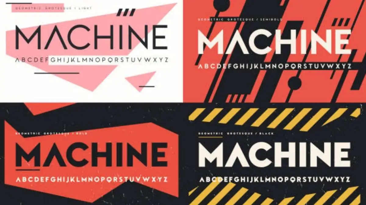
TypeType: A Reliable Font Foundry
TypeType is one of the most reliable foundries in the design world. Its fonts are used by big brands and creative professionals everywhere. TypeType focuses on making fonts that look modern, readable, and flexible.
Some of its popular fonts TT Norms Pro, TT Commons, and TT Ricordi work beautifully in posters. They are balanced, sharp, and stylish. Designers use TypeType fonts because they look good both in digital and printed posters.
Every TypeType font is tested for size, spacing, and readability. That’s why the text always looks clear and bold, even from a distance.
What Makes a Good Font Foundry
A good font foundry focuses on both beauty and function. Fonts should not only look nice but also be practical for use in real designs.
High-quality foundries test their fonts carefully before release. They make sure the letters look good in different weights, and styles. This helps your poster look balanced and professional in all aspects.
Mistakes to Avoid When Choosing Fonts
Many people choose fonts just because they look cool, without focusing about readability. Fancy or over-styled fonts can make posters hard to read.
Another mistake is mixing too many fonts. Each foundry has its own design logic. Mixing them can create confusion for the readers.
It’s best to use one font family like those from TypeType, which offers multiple weights and styles that fit perfectly together.
Tips for Using Fonts from a Font Foundry
When designing a poster, use a large, bold font for your main title. This catches attention fast. Use lighter or smaller fonts for details.
Keep enough space between lines and letters so your text looks clean. Also, use colors that contrast well with the background.
If your background is bright, go for dark text. If it’s dark, light fonts work better. Testing your poster from a few steps away helps you see if the text is easy to read.
Why Designers Prefer TypeType Fonts
Designers trust TypeType because its fonts are simple, stylish, and flexible. They work well in many industries from tech and fashion to education and art.
Each TypeType font is made to look good in both digital and printed posters. The foundry offers fonts with smooth curves, neat spacing, and multiple language support.
When designers use TypeType fonts, they don’t need extra editing the fonts already look polished and professional.
Final Thoughts on Font Foundry
A good font foundry makes all the difference in a poster design. Fonts are not just text they carry feeling, style, and meaning.
Using fonts from a trusted foundry like TypeType gives your posters a clean, bold, and professional look. When your fonts are strong, your message becomes much clear. And that’s what makes a poster stand out in rest.

Third Eye Chakra Insights: Meaning, Signs, and Benefits

28-Day Chair Yoga Challenge: A Practical Guide

4 Person Yoga Poses for Beginners

Chair Yoga for Seniors: Improve Balance, Mobility, and Flexibility

How to Pass the Civil Service Exam in 2026: What Every Applicant Should Know Before Test Day

How to Approach a Girl at the Gym Respectfully

What is Kundalini

Discover the Different Types of Yoga Breathing Techniques

Modern Trends in Sports Court Construction and Maintenance

Invisible Orthodontics: Modern Solutions for Straighter Smiles

Why EN14960 Certification Is Important for Inflatable Businesses?

Master the Fly Pose: A Step-by-Step Guide for Yoga Enthusiasts

Partner Yoga Poses: A Journey of Connection, Trust, and Balance

Unlocking the Healing Power of Tibetan Singing Bowls: A Comprehensive Guide

Kundalini Awakening: Balancing Energy Through Yoga
-
 GENERAL9 months ago
Christofle – For Those Who Dream of Family Heirloom Silver
-
SPORTS11 months ago
Discover the World of Football with Streameast: Watch Your Favorite Leagues and Tournaments
-
GENERAL3 months ago
Uncovering the World of кинокрадко: The Dark Side of Film Piracy
-
GENERAL5 months ago
ATFBooru: Anime, Gaming, and Subculture Imageboard