
Tech
Pxless: A Modern Approach to Responsive Web Design
As a web designer, I’ve seen how quickly design philosophies evolve. The days when fixed pixel values dominated are behind us, largely because users now access the web from a wide variety of devices, screen sizes, and resolutions. In this landscape, Pxless has emerged as a modern web design philosophy that rethinks how we approach layout and typography. Instead of locking elements into rigid pixel values, it prioritizes fluid, responsive, and adaptive design principles that ensure accessibility and consistency across different devices.
Table of Contents
What Is Pxless?
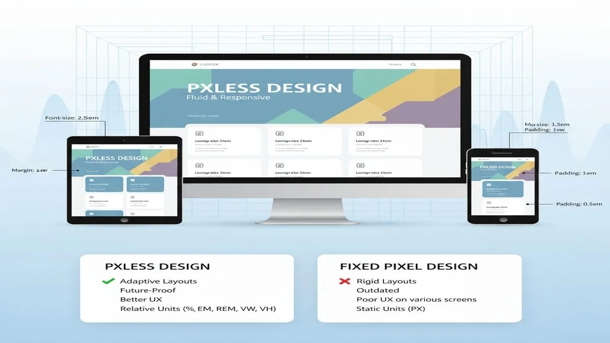
Pxless is not a framework or a tool but a design philosophy. At its core, it reduces dependence on fixed pixel measurements and instead encourages the use of relative units such as:
- Percentages (%): to create flexible containers and elements that adapt to available space.
- em/rem: to define typography and spacing relative to font sizes, making designs more scalable.
- Viewport units (vw, vh): to adapt elements based on the width and height of the user’s screen.
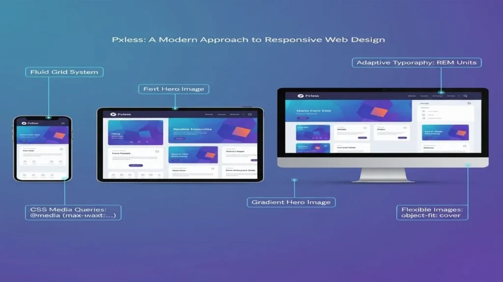
By doing so, Pxless allows every design component, whether text, spacing, or imagery, to scale proportionally. The result is a fluid interface that responds naturally to its display context.
Why Fixed Pixels Are Limiting
For years, web designers relied heavily on fixed pixel values to control layout precision. While that method worked in the early 2000s, when desktops were the primary browsing medium, it quickly became unsustainable.
Today, users interact with websites through:
- Smartphones with narrow portrait views
- Tablets with multiple orientations
- Laptops with mid-sized screens
- High-resolution desktops and ultrawide monitors
Fixed pixels cannot account for this diversity. They often cause accessibility issues, break layouts on small screens, and require developers to build multiple versions of the same design. This is where Pxless provides a meaningful shift.
How Pxless Improves Responsive Design
1. Scalable Typography
Using rem or em units allows text to grow or shrink depending on the user’s device or browser settings. This ensures legibility without requiring manual adjustments for each breakpoint.
2. Fluid Layouts
By defining containers with percentages or viewport units, layouts automatically adjust to the available space. This creates a seamless transition between devices without relying on dozens of media queries.
3. Inclusive and Accessible Design
Accessibility is central to modern web standards. Pxless supports inclusivity by respecting user preferences, such as larger text for readability. This approach is in line with WCAG (Web Content Accessibility Guidelines), which recommends avoiding fixed sizes for better accessibility (W3C, 2018).
4. Efficiency for Developers
Developers save time because they don’t have to manually tweak pixel values for every device. This efficiency also translates into lower maintenance costs.
Practical Examples
- Typography: Setting body text at 1rem and scaling headings in relative units ensures that the entire typographic system remains proportional if the base font size changes.
- Layout Grids: Instead of setting a container width at 1200px, I use 80% or 90vw. This way, the container adapts to the screen while maintaining consistent margins.
- Spacing: Margins and paddings defined with em or rem units scale naturally with text size, preventing cramped layouts on small screens.
These adjustments might seem small, but collectively they create a fluid and adaptive design that prioritizes usability.
Pixel-First vs. Pxless: A Side-by-Side View
| Aspect | Pixel-Based Design | Pxless Design |
| Scalability | Limited, often breaks on different screens | Flexible, adapts to all screen sizes |
| Accessibility | Text may be unreadable if fixed | Supports user preferences and scaling options |
| Maintenance | Requires frequent adjustments | Less maintenance due to fluid layouts |
| Performance | Can bloat code with multiple fixes | Cleaner, more efficient implementation |
Pxless and Accessibility
One of the most compelling reasons to adopt Pxless is accessibility. According to the World Health Organization (2023), over 2.2 billion people live with some form of vision impairment. Web design that ignores scalability risks alienates a significant portion of the population.
It mitigates this issue by allowing users to control how they view content. If someone increases the default font size in their browser, a Pxless-based design adjusts proportionally rather than breaking the layout. This inclusivity aligns with the principles of universal design, creating products usable by as many people as possible without requiring adaptation.
Challenges and Considerations
While Pxless offers many benefits, it is not without challenges. In my experience, developers and designers need to carefully manage:
- Complex Scaling Behaviors: When everything is relative, unexpected scaling can occur if relationships between units aren’t well-structured.
- Browser Compatibility: While modern browsers handle relative units well, edge cases may still exist, especially on older devices.
- Performance Testing: Developers must test across a wide range of devices to ensure that fluid scaling doesn’t compromise usability or aesthetics.
Despite these challenges, the trade-offs are worthwhile for most projects.
The Broader Impact of Pxless
Beyond technical implementation, Pxless signals a cultural shift in web design. It encourages us to prioritize users rather than strict visual control. This reflects broader industry trends, where accessibility, inclusivity, and device diversity drive innovation.
Moreover, Pxless aligns with sustainable web practices. By reducing the need for multiple device-specific designs, it cuts down on redundant development time and resources, making projects more efficient.
FAQs
1. Is Pxless compatible with CSS frameworks like Bootstrap or Tailwind?
Yes, its principles can be applied alongside frameworks by using relative units instead of fixed pixels.
2. Does Pxless work well with fluid images and videos?
Absolutely, it supports responsive media by combining relative units with CSS properties, such as max-width: 100%.
3. Can Pxless improve website performance?
Indirectly, yes, by reducing redundant breakpoints and simplifying code, it can streamline development and maintenance.
Conclusion
In today’s digital environment, flexibility is essential. Pxless represents a forward-thinking approach to web design that moves away from the limitations of fixed pixel values and embraces the power of relative units. For designers like me, it’s not just about making websites look good; it’s about ensuring that they work for everyone, on any device, in any context.
By adopting it, we create designs that are more responsive, accessible, inclusive, and future-ready. While it requires careful planning and testing, the long-term benefits for both users and developers are undeniable.

Inside Scoop: Dhamaka Zone Celebrity Gossip Uncovered

RTasks EHR: Streamlined Care Management for Facilities

Explore Peñiculs: Holistic Framework for Complete Well-being

Retro Bowl 3kh0 Unblocked: Play the Classic Football Game Anywhere

SkyWestOnline: Complete Guide for SkyWest Employees

Setu Bandhasana Guide: Benefits, Technique & Safety Tips

How a Cooling Vest Helps You Recover After an Intense Workout or Yoga Flow

Top 10 Leading US Bronze CNC Machining Factory

Why Cybersecurity Is Essential for Modern Energy Infrastructure

Yoga Nidra: Deep Relaxation and Mindful Awareness

10 Benefits of Joining Prenatal Yoga Classes Online

TamilYogi: Pirated Tamil Movies & TV Shows

Discover Jadeitový kameň: Symbol of Purity and Strength

Discover Mannacote: The Natural Alternative to Chemical Preservatives

Why Many Americans Purchase HGH in Mexico
-
 GENERAL8 months ago
Christofle – For Those Who Dream of Family Heirloom Silver
-
SPORTS10 months ago
Discover the World of Football with Streameast: Watch Your Favorite Leagues and Tournaments
-
GENERAL2 months ago
Uncovering the World of кинокрадко: The Dark Side of Film Piracy
-
GENERAL5 months ago
ATFBooru: Anime, Gaming, and Subculture Imageboard