
GENERAL
The Role of Color Psychology in Modern Home Staging
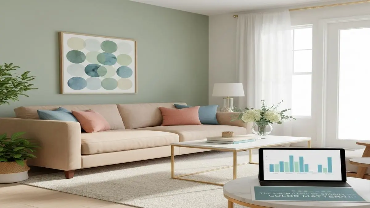
Color plays a powerful role in shaping the way people experience a home. Long before furnishings or décor are noticed, color sets the emotional tone of a space, influencing how welcoming, calming, or energizing it feels. In the world of Home Staging, understanding how color affects perception has become essential for creating interiors that attract buyers and leave lasting impressions. Thoughtful color choices influence mood, enhance flow, and help potential buyers envision the lifestyle a home can offer. This makes color psychology a strategic tool that stagers rely on to elevate both appeal and value.
Modern buyers look for homes that feel balanced, emotionally soothing, and visually cohesive. Color supports these expectations by guiding the eye from one room to another with comfort and clarity. Whether soft neutrals or subtle accent hues are used, the right palette can transform even the simplest space into one that feels refined and memorable. Professionals like Greylyn Wayne understand how color contributes not just to beauty but to connection, creating a sense of harmony that encourages buyers to picture themselves living effortlessly within the home.
Because color influences both emotion and interpretation, Home Staging relies on palettes that create broad appeal. While personal interior choices may lean bold or expressive, staging colors are selected with universality in mind. This ensures that every visitor experiences the home in a way that feels inviting, comfortable, and full of potential.
Table of Contents
Why Color Matters in Buyer Perception
Color shapes the atmosphere of a room instantly. Before furniture placement or lighting adjustments are considered, the palette sets expectations. Soft tones tend to create calmness, while bright or saturated hues introduce energy. Portland home staging professionals use this knowledge to enhance the emotional experience of each room. A cool, balanced palette may evoke relaxation in a bedroom, while subtle warm tones can make a living room feel more social and inviting.
Buyers often make quick judgments when touring a property, and color can either reinforce or disrupt those impressions. A room painted in overly bold shades may distract from its size and structure, while a well-chosen neutral can highlight space and architectural detail. In Home Staging, the goal is to make rooms feel open and adaptable, allowing buyers to imagine their own style without visual obstacles.
The Power of Neutrals in Staging
Neutral colors remain the foundation of effective staging because they appeal to a wide range of tastes. Soft whites, gentle beiges, and muted grays create a blank canvas that feels fresh, timeless, and calming. These tones allow potential buyers to focus on the flow of the home rather than being distracted by strong personal expression.
Neutrals also help emphasize natural light. Sunlight reflects beautifully off lighter tones, making rooms appear brighter and more spacious. This effect supports one of the biggest goals in Home Staging—ensuring each area feels as open and inviting as possible. Professionals often pair neutral walls with subtle textures in rugs, pillows, or artwork to bring dimension without overwhelming the eye.
Using Accent Colors to Add Character
While staging leans heavily on neutrals, carefully placed accent colors add personality and interest. Accent hues might appear in decor, artwork, or small decorative pieces to create warmth and variation. Blues often evoke calmness, greens symbolize freshness, and soft earth tones promote comfort. The key is subtlety; accents should enhance rather than dominate.
Thoughtful accents also help define the purpose of each room. A touch of blue in a bathroom can create a spa-like feeling, while warm terracotta shades in a dining area can evoke a sense of hospitality. Designers like Greylyn Wayne use accents strategically to ensure color supports the overall narrative of the home while maintaining broad appeal.
How Color Affects Room Size and Flow
Perceived room size can change dramatically based on color selection. Light colors tend to make rooms feel larger by reflecting more light, while darker shades can create cozy, intimate settings. Stagers select colors based on how they want the room to feel and how buyers are likely to interpret the space.
Flow is equally important. When colors shift too dramatically from one room to another, it can disrupt the sense of continuity. Staging often uses complementary tones throughout the home to create smooth transitions. This consistency supports visual harmony, making the entire property feel organized and thoughtfully designed.
Color also guides movement. A well-coordinated palette encourages buyers to naturally explore the home, moving from one area to the next with ease. This subtle direction enhances the showing experience and supports a positive emotional response.
Creating Emotional Connection Through Color
One of the most powerful aspects of Home Staging is its ability to evoke emotion. Color plays a key part in developing that connection. Soothing tones can help buyers feel at peace, warm accents can suggest comfort, and balanced palettes can create a sense of familiarity. When color is used intentionally, it shapes how a buyer feels in each room and whether they can imagine living there.
Color can also express lifestyle without becoming personal. For example, soft coastal tones might suggest relaxation, while earthy neutrals hint at natural simplicity. These emotional cues influence buyer imagination and can make a home feel more relatable and desirable.
Avoiding Common Color Mistakes in Staging
While color can enhance a home, the wrong palette can be distracting. Overly bold colors may appeal to some buyers but deter others. Busy combinations can make rooms feel smaller or cluttered, reducing overall appeal. Staging professionals avoid these pitfalls by selecting balanced tones that support clarity and space.
Another common issue is ignoring lighting. A color that looks perfect in natural daylight can feel different under artificial lighting. Stagers test tones in multiple conditions to ensure consistency. This careful attention to lighting ensures that the home feels cohesive and inviting throughout the day.
Coordinating Color With Furnishings
Color is not limited to walls. Furniture, décor, and textiles all contribute to the overall palette. Staging professionals coordinate furnishings with wall colors to create unity. When done well, this harmony makes a space feel complete and thoughtfully curated.
Textures also play a role. Soft fabrics, natural fibers, and layered materials introduce depth without relying on bold color. This approach enhances comfort and visual interest in subtle, buyer-friendly ways.
The Future of Color Trends in Staging
Color trends continue to evolve, but staging remains focused on timeless appeal. Soft earth tones, warm neutrals, and gentle greens have become popular because they feel modern without overwhelming the senses. These colors pair well with contemporary furnishings and natural textures, creating homes that feel both current and enduring.
Increasingly, buyers favor peaceful environments, and color choices reflect this desire for calm. Professionals such as Greylyn Wayne stay ahead of emerging trends while maintaining the universal appeal needed to attract diverse buyers.
Conclusion: Color as a Foundation of Effective Staging
Color psychology is a vital element of Home Staging, shaping the way buyers feel, move, and connect with a space. Through carefully selected palettes, stagers create homes that feel balanced, inviting, and full of possibility. Color enhances architectural strengths, guides attention, and supports a sense of flow that makes each room feel purposeful and appealing.
By applying thoughtful color strategy, staging turns houses into homes that resonate emotionally with buyers. Through this approach, Greylyn Wayne continues to demonstrate how color transforms perception, elevates value, and helps potential buyers imagine their future with clarity and confidence.

Holistic Chiropractic Care: A Comprehensive Approach to Health and Wellness

How to Stay Anonymous on the Internet

How Medical Treatment Timing Affects Your Car Accident Claim

OTI IAS: Modern UPSC Preparation Competency Model

Why Local Connection Still Matters When Choosing NDIS Providers in Preston

Privacy Curtain Design Considerations for Hospitals, Clinics, and Medical Centers

Medical Software Solutions: Comprehensive Guide for Choosing a Robust DAX Copilot Alternative

How DAX AI Scribe Transforms Patient Documentation Efficiency

Artificial Fall Wreath vs Natural Fall Wreath: Which Looks More Authentic?

Faux Plants vs Real Plants: Which Is More Cost-Effective for Home Decor?

Pravi Celer: Stalk Celery Uses, Benefits, and Identity

What Is Stormuring? A New Era of Strategic Agility

Foenegriek (Fenugreek): Health Benefits, Uses & Substitutes

Uncuymaza: Leading Higher Education in Mendoza, Argentina

BCN Play OTT: Basic & Platinum Streaming Bundles
-
 GENERAL12 months ago
Christofle – For Those Who Dream of Family Heirloom Silver
-
SPORTS1 year ago
Discover the World of Football with Streameast: Watch Your Favorite Leagues and Tournaments
-
GENERAL5 months ago
Uncovering the World of кинокрадко: The Dark Side of Film Piracy
-
GENERAL2 months ago
Unveiling the Art of преводсч: How Translators Bridge Language Barriers